Product help belongs where users get stuck
Reactive chat is fine. The problem is what most products put inside it. Better in-product guidance is contextual, in-line, and proactive, and it reaches users before they ever click the question mark.

A reasonable take on in-product help is "let users ask." Put a chat widget in the corner, let the user click when they need help, answer their question. We do that. So does everyone else in the category. Reactive Q&A is part of the job.
The problem isn't reactive help. The problem is what most products put inside the chat.
Click most chat icons today and you get one of two experiences. The first is a 12-step help-center article shoved at you in a single bubble, formatted from a knowledge base your product team last edited eight months ago. The second is a link out to a stale manual that asks you to leave the product, read it, and somehow translate the prose back into the screen you were on. Neither is meeting the user where they are.
The shape of the chat surface isn't the issue. The shape of the answer is.
Reactive help, done well
Reactive Q&A inside a product can be excellent. The bar is:
- It answers in the user's product, not in a sidebar to a help center.
- It cites the actual workflow the user is on, not a generic prose article that may or may not still be accurate.
- It can perform the action the user asked about, not just describe it.
That's the form of reactive help we ship and the form we think is worth keeping. The chat icon isn't the villain. The 800-word article it sometimes opens is.
The bigger move: stop waiting to be asked
The deeper opportunity sits one level above reactive. Most stuck moments don't end in a chat message. They end in a quiet bounce. The user got confused, gave up, and closed the tab. By the time they would have typed something into the widget, they were gone.
Closing that gap means the help has to come to them.
Three patterns, in roughly increasing order of impact:
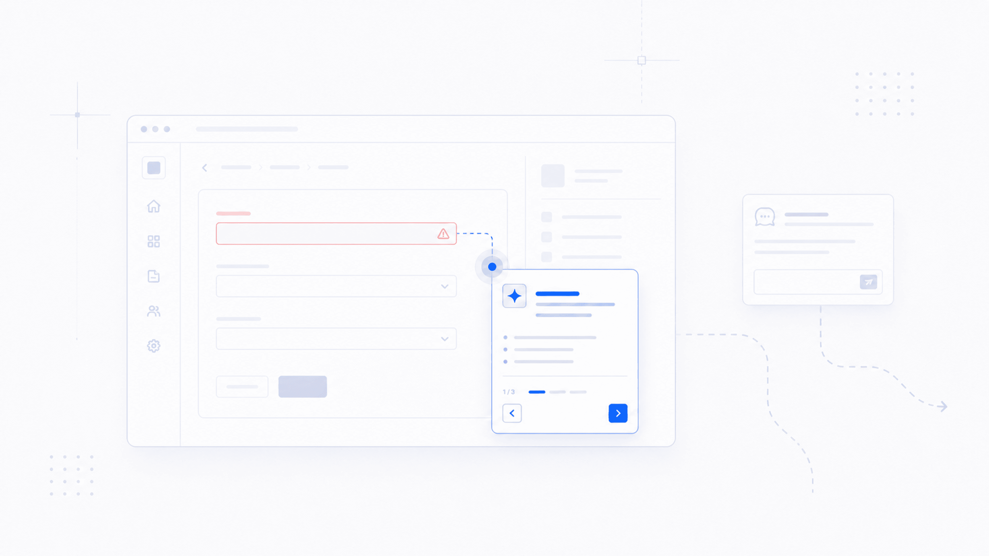
Proactive nudges based on user signals. When the user just upgraded, just hit an unfamiliar admin screen, or just clicked the same path three times without finishing it, the product knows. A short, contextual prompt that says "looks like you're trying to set up role-based permissions, want me to walk you through it?" lands meaningfully better than waiting for them to ask.
In-line CTAs on errors and gotchas. When something fails, the error itself should be the help. "Permission denied" is technically correct and operationally useless. "Your account doesn't have permission to do this; here's the button to ask your admin" is help. The error and the recovery should be the same surface. Many of our customers ship exactly this pattern, building these CTAs against our SDK so the error message has a button that walks the user the rest of the way.
Context-aware tour replacements. Where a traditional tour was a fixed set of tooltips, a modern equivalent is a short, agent-driven walkthrough triggered by the user's actual state. The user gets a tour that's specific to what they're trying to do, not a generic intro a marketer built two years ago.
We see these patterns getting built on top of our SDK every week. The shape of in-product help is changing toward something more proactive, more contextual, and more action-oriented. Not because the chat widget is being replaced, but because what you put around it finally has somewhere to go.
A small reframe
We've started telling customers to think about help as a layered system rather than a single surface.
The reactive chat handles the user who decides to ask. It should be excellent: contextual answers in their product, no help-center sidekick.
The proactive layer handles everyone who would have asked but didn't. Nudges before they bounce, in-line prompts at error states, walkthroughs triggered by what they're already trying to do.
The teams that build both layers, not just the first one, are the ones that quietly make their products feel like there's a smarter team behind the screen. The team is usually the same size. The shape of the help just got better.
The freshness tax
Every help article, every onboarding tour, every demo script is a snapshot of a product that has already moved on. The cost compounds quietly, and it's the line item nobody puts on a dashboard.
The moat just flipped: shipping faster used to break your help center
For a decade, every product release was a new tax on the team that maintains help docs and onboarding. The math has inverted. Shipping fast is now an asset for the customer, not a liability for the docs team.
When an AI agent should refuse to answer
AI agents are wired to answer. The good ones know when to refuse. Why "I don't know" is the most expensive feature to build, and the one users trust most.