How we migrated our marketing site off Framer to code
AI didn't one-shot our marketing site. It made the rebuild cheap enough to be worth doing anyway.

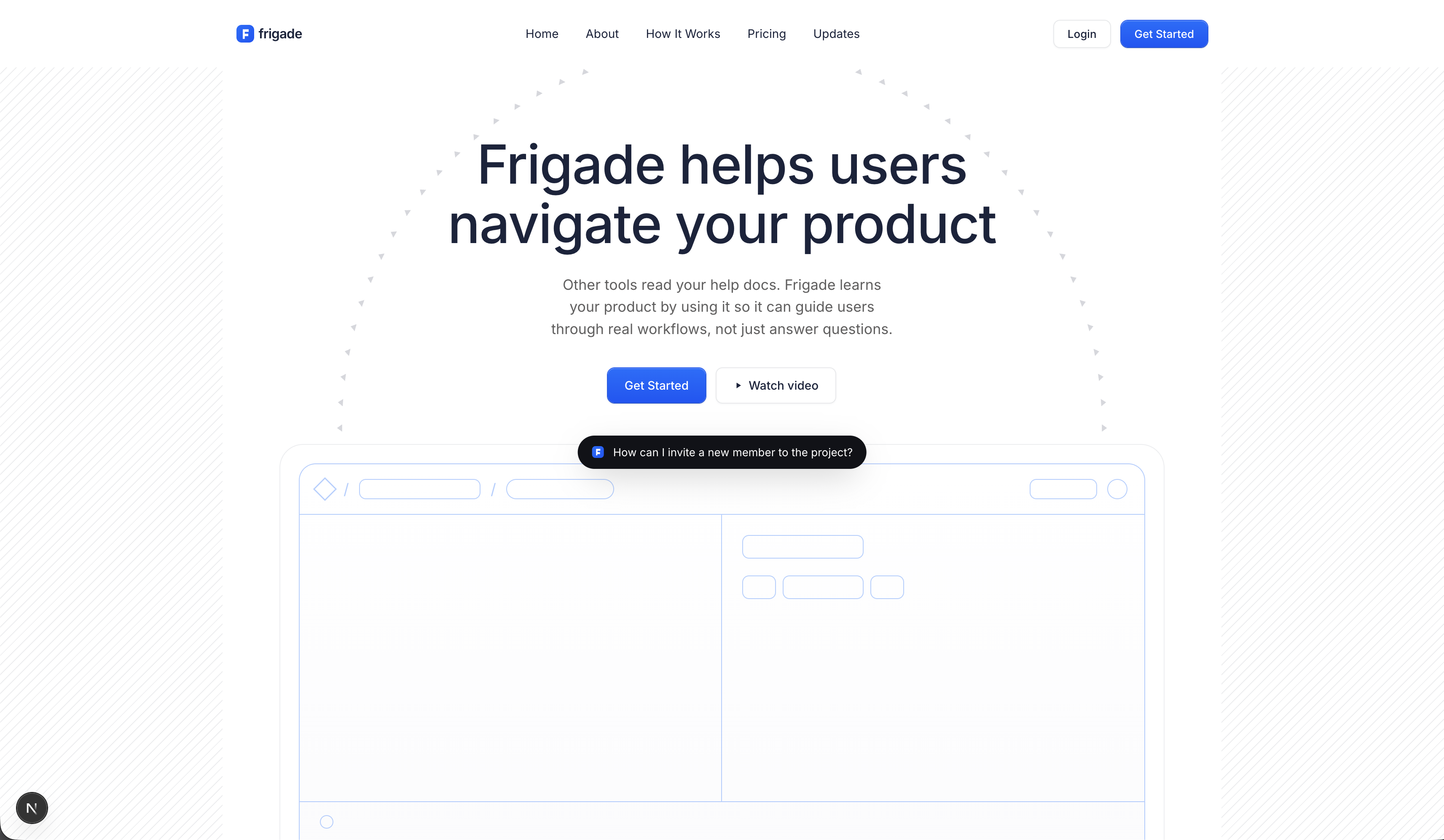
We just rebuilt our marketing site by migrating off Framer to code in a week, voice-only, with help from Claude. Here's how it went.
A separate post is coming soon on why we made the move. The short version: AI made writing code cheap enough that no-code's biggest value (not having to involve engineering) doesn't carry the weight it used to. We believe many teams currently running on no-code will reach the same conclusion soon (if they haven't already).
Most of what's below is method, not Framer-specific. If you're on Webflow, Wix, Squarespace, or another visual builder, the export tools differ but the playbook is the same.
The dead ends, first
Before what worked, here's what didn't, in case you're tempted by the same shortcuts.
One-shotting the whole site
The first thing I tried was the wishful thinking that Opus 4.7 might just clone the site for me. I pointed Claude Code at the existing Framer site, asked it to recreate the whole thing, and walked away to make coffee. I came back to a generic SaaS clone that bore only a passing resemblance to our actual site. Useful as a sanity check that this dead end is, in fact, a dead end. Useless as a starting point.
The popular open-source cloner
Then I tried a Reddit-promoted Claude skill, JCodesMore/ai-website-cloner-template, with thousands of GitHub stars and a "clone any site in a single command" pitch. The output was potato quality. A scammer-grade clone that hadn't bothered grabbing the real assets and had recreated them poorly. Not even useful as a reference. (No shade to that template; it's a fine starting point for a hobby clone, but it isn't pretending to be production-ready.)
The takeaway: don't expect a one-command migration to work. Plan for a real rebuild and use the existing site as reference material, not as a starting point.
Salvaging what Framer would give back
Framer's CSS is obfuscated on purpose. The export tools each lose something different, and Claude's first attempts to read raw exports kept stalling on opaque class names and absolute-positioning soup. Three plugins did most of the heavy lifting:
- Framer-to-Figma export (Figma community plugin). Pulls the design out of Framer into a Figma file you can share with Claude as visual reference.
- Figma-to-code (Figma community plugin). Turns the Figma file into a code-ish version of the site. Imperfect, but the structure is nonzero, and Claude can read it as scaffolding.
- Single-file HTML save (Chrome extension). Saves each page as one self-contained HTML file. Useful for asset capture and as a layout reference Claude can read directly.
What survived: layout reference, content, most static assets. What didn't: animations and most illustrations. Anything that crosses the export boundary loses a lot in transit.
Section by section, not page by page
Once I gave up on one-shotting, I tried page by page. That also failed for the same reason: the model doesn't know what great looks like at page-level granularity, even with saved HTML and screenshots as reference. The output reads as generic SaaS sludge.
What worked was section by section. The hero first: title, subtitle, background SVGs, an animation placeholder. Then the header. Then the footer. Then the next module. Each one dialed in before the next started.
Each section took ten minutes to an hour. Broad strokes first ("get the layout right, get the colors close"), then details ("the spacing is off here, the type ladder needs to be tighter, the sticky behavior needs to clear the announcement banner"). The model could close the gap when I anchored it with a saved page, a screenshot, or an existing component, and asked for small steps.
Building the design system as we went
Once a hero, header, and footer existed, every subsequent page came faster. The mental model: tokens first, components second, design system third, pages fourth.
We built components/marketing/ for small primitives (Container, Eyebrow, SectionHeading, CtaButton), components/sections/ for section-sized pieces, and components/ui/ for shadcn-style primitives. By the time we were generating full pages, the design system had enough of our brand in it that the output looked like our site, not a SaaS template.
By the end of day one, the homepage was scaffolded end to end: hero through footer. Day two was polish and the additional pages: About, How It Works, Pricing, and Engage. Five pages on a design system that didn't exist a day earlier.
The whole thing was voice-only
The whole rebuild was voice-only. I never typed a prompt. The cliche about voice is that you give up precision when you stop typing. What I noticed once I tried it is that precision wasn't the bottleneck. Typing is precise but slow. Voice is sloppy and fast, and the model is smart enough to figure out what I meant even when I contradicted myself mid-sentence or the transcription dropped a word.
Here's a real prompt — verbatim, run-on, the kind of thing typing self-edits out of:
Working on a rebuild of the engage product page on the new site. The old site has like five engage pages mashed together, and I want one page: opens with the engage product story, moves into the three modules, then a customer logo strip and the CTA. Use the section primitives we've already built. Don't make new ones. Keep content placeholder for now, we'll come back to copy. High fidelity on the layout though.
The whole Engage page came out of that. We've started calling it yap-driven development™, which is a joke and approximately accurate.
Real UI as illustration
For the more complex sections, the trick wasn't polishing illustrations. It was skipping illustrations entirely.
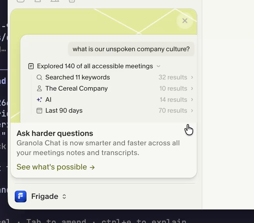
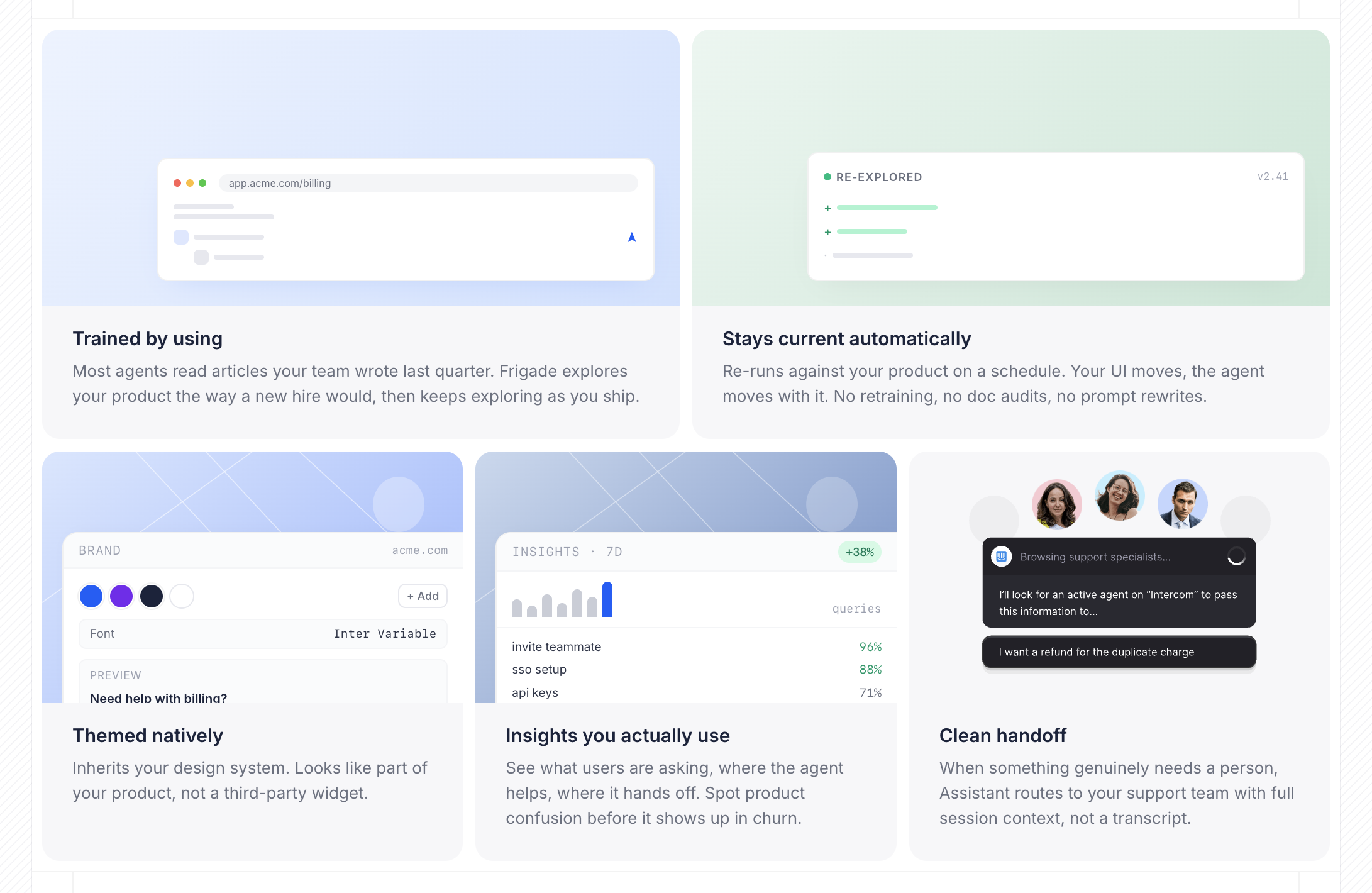
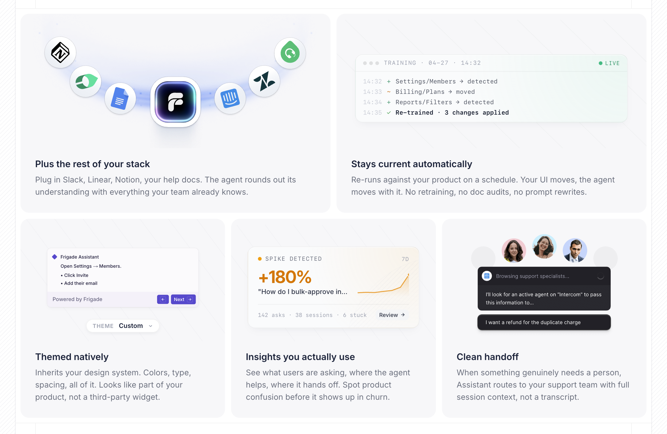
Claude isn't great at generating images, but it's very good at building UI. We've seen the same pattern emerging in the wild. Granola is a good example. What reads like an illustration in their product is actually working UI: resize the sidebar and the layout responds. Likely built with AI assistance itself.
We took the same approach for the five "Frigade Assistant, end to end" cards on our homepage. The first pass borrowed Granola's framing as reference but came back classically Claude-designed. The polish came from iterating on the components themselves and refining the references, not from re-rolling images.
The "while we're here" pattern
Most of the polish wins weren't on the rebuild plan. They were "while we're here" moves that became cheap enough to ship. Worth budgeting for these explicitly: the first time you notice that polish is essentially free, you start adding it everywhere. Examples from our rebuild:
- A custom active-tab indicator in the nav, recreated in pure CSS in minutes.
- React code blocks inside blog posts.
- A markdown blog system that replaced our third-party CMS.
- A visual draft-and-publish flow for posts.
- A new product-page chooser.
When we paid the agency $450
One caveat on the do-it-all-with-AI claim. When we needed to wire the second studio's existing Rive hero animation into the new site, we hired the studio back for an evening at $450 to export it cleanly and get the timing right. That was the only paid outside work in the rebuild, and it was worth it.
AI doesn't replace the agency, it narrows what you hire them for. The replaceable work (layout, structure, most assets) is now cheap to do with a model. The specialty work, the kind that's easier to commission than reverse-engineer, still goes to the studio, just at a fraction of what the full engagement used to cost.
The launch checklist
The launch was its own work. Old URL audit, redirect map, sitemap, robots.txt, llms.txt, dynamic OG, structured data, metatags. Claude was good at it. We ran SEMrush and Ahrefs over the top to catch what we missed.
Caveats
I wouldn't ship a production SaaS product built voice-only in a weekend and trust it with customer data. A marketing site is its own category: no sessions, no API keys, no user records to corrupt, no audit log to keep clean. The thing that has to be good is the presentation. That's where AI is suddenly cheap, and that's the slice this guide applies to.
If your site is small, your design system is set, and your team doesn't write code, Framer can still be the right answer. I would not migrate an existing site for the sake of migrating.
If you're hitting the ceiling, the move back to code is shorter than it looks.
Two easing curves and no animation library
The Frigade marketing site ships zero animation dependencies. Here's why CSS alone got us further than Framer Motion would have, and what the system actually looks like.
The freshness tax
Every help article, every onboarding tour, every demo script is a snapshot of a product that has already moved on. The cost compounds quietly, and it's the line item nobody puts on a dashboard.
The moat just flipped: shipping faster used to break your help center
For a decade, every product release was a new tax on the team that maintains help docs and onboarding. The math has inverted. Shipping fast is now an asset for the customer, not a liability for the docs team.