Two easing curves and no animation library
The Frigade marketing site ships zero animation dependencies. Here's why CSS alone got us further than Framer Motion would have, and what the system actually looks like.

The Frigade marketing site has scroll-driven compass rotations, staggered hero reveals, a procedurally generated knowledge graph, cursor choreography that tours a UI on loop, and a banner with four independently drifting aurora blobs. The animation dependency count is zero.
We found that there's no need for stuff like Framer Motion/GSAP/React Spring anymore. The motion system is CSS keyframes, @starting-style, two requestAnimationFrame loops, and two easing curves that carry nearly everything.
The problem with reaching for a library
The default move for animation in React is to install something. Framer Motion is the usual answer. It makes a ton of the more complicated, multi-step animations easier to write. It's also 30kB+ of JavaScript that needs to hydrate, and it pulls every animated component into the client bundle whether the animation is interactive or not.
For a server-rendered marketing site, that trade goes the wrong direction. Some if not most viewers are going to be looking at this site from their phone when they hear about Frigade quickly or maybe they've been sent a link from a friend. We want this site to load as close to instantly as possible. That means keeping the bundle lean.
Most of our animations are entrance transitions and looping choreography. They don't respond to gestures. They don't need spring physics. They need to play once, look clean, and stay out of the main thread.
The question we kept coming back to: what do we actually need an animation package for? The answer was less than expected.
Two curves, one motion language
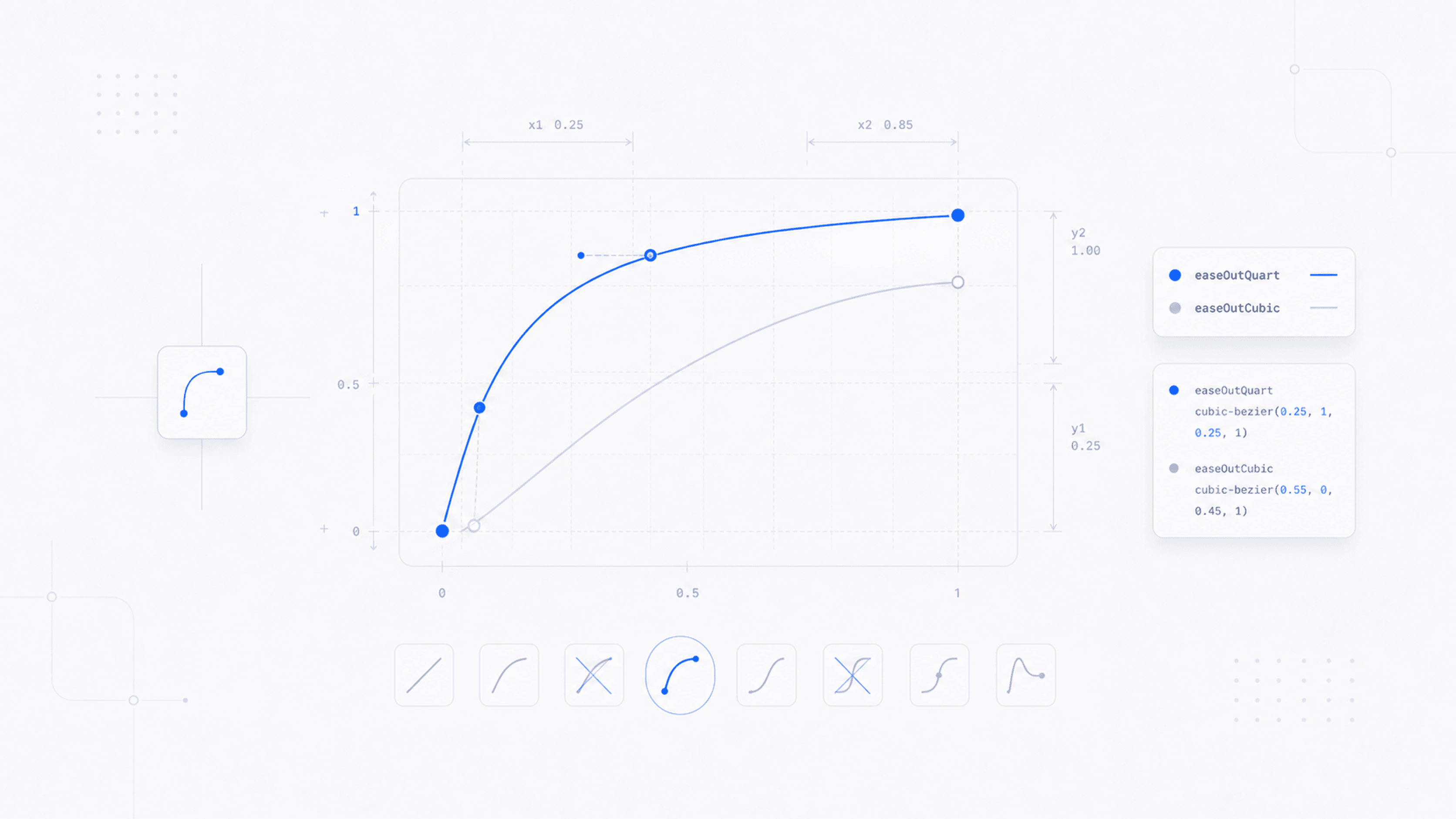
The vocabulary is built on two cubic-bezier curves.
The entrance curve: cubic-bezier(0.23, 1, 0.32, 1). Fast attack, long gentle deceleration, slight overshoot. Every hero reveal, every banner fade, every form error state uses this one. 480ms for content reveals, 900ms for the banner. The overshoot is subtle enough to feel alive without reading as playful. We try to keep things quick, snappy, but also sturdy!
The interaction curve: cubic-bezier(0.32, 0.72, 0, 1). Tighter, closer to your traditional micro-interaction curve. Dropdowns, modals, hover scales, button presses, the video lightbox. 150ms to 220ms. Fast enough that the UI feels immediate, slow enough that the transition registers.
That's the system. Two curves handle roughly 90% of the motion on the site. The remaining 10% is linear for marquees and ease-in-out for looping ambient motion like the aurora drift and theme-slot cycling. The constraint ended up being a feature: the site has a coherent motion language because the vocabulary is small enough to stay consistent.
Three decisions that made CSS-only viable
1. @starting-style for one-shot entrances. The hero stagger is a pure CSS transition, no useEffect, no ref. The browser handles initial state, the transition, and the cleanup. We hit a race condition early where some browsers repainted before the stylesheet loaded, causing a perceived double-play with @keyframes. @starting-style solved it because transitions fire once on DOM insertion and can't replay on CSS re-evaluation. Each hero child gets a staggered delay (0ms, 60ms, 120ms, 180ms, 240ms, 300ms), a translate3d(0, 8px, 0) starting offset, and the entrance curve. Clean, no JavaScript.
2. prefers-reduced-motion as a P0. There's a global safety net in the stylesheet: every element, ::before, and ::after gets animation-duration: 0.01ms and transition-duration: 0.01ms when prefers-reduced-motion: reduce is active. Duration stays above zero so animationend events still fire and dependent logic doesn't break. The JS-driven components (compass markers, knowledge graph) read the media query separately and zero their motion. This was the first thing we wrote, not the last.
3. GPU promotion where it counts. The compass markers use will-change: transform on the rotating SVG groups. Without it, mobile scrolls retrigger a paint of the surrounding compass image on every frame, and you feel it. The hero entrance uses translate3d instead of translateY to force compositor promotion. Small details, real impact on actual phones.
Where JavaScript still earns its keep
Not everything is CSS. The compass markers rotate proportional to scrollY at 0.12 degrees per pixel, so they need a requestAnimationFrame loop with a passive scroll listener. The knowledge graph is procedural: nodes and edges fade in and out on 600ms ticks with random positions constrained by minimum-distance rules. The cursor tours are mostly CSS keyframes, but the interactive variants need component state.
The split is clean. CSS handles all the choreographed, predictable motion. JavaScript handles the dynamic, state-dependent motion. Nothing lives in both camps.
Developing taste
The technical choices are the easy part. Picking cubic-bezier(0.23, 1, 0.32, 1) over ease-out isn't a science problem, it's a taste problem. You have to watch enough motion to know when something feels right versus when it feels like a stock template.
Two resources shaped how we think about this. Emil Kowalski's animations.dev is the best single resource on web animation craft I've found. It covers easing, springs, layout animations, and the details that separate motion that feels considered from motion that feels default. A lot of the curve intuition behind our system came from studying his work. I take the train to work so I literally just crack away at this site for 15 minutes before work every day.
Benji Taylor's site is a different kind of reference. Less instructional, more "here's what it looks like when someone cares about every pixel of motion on a page." Spending time with work like his recalibrates what you think is possible in a browser, and more importantly, what you think is worth the effort.
The point isn't to copy. It's to build a visual library in your head so that when you're tweaking a 480ms entrance transition, you have opinions about whether the overshoot is too much or not enough. That instinct doesn't come from documentation. It comes from watching good work and then going back to your own code and noticing what's off.
What's next
The system has rough edges. The cursor tour keyframes are hand-authored timelines that describe specific UI walkthroughs: navigate a dropdown menu, fill out a form. They work, but they're brittle to layout changes. If the mock UI shifts by 20px, the keyframe percentages need manual recalculation. We haven't found a good abstraction for that yet without pulling in a timeline library, which defeats the point.
The @starting-style approach has a browser-support gap too. Chrome 117+ and Safari 17.5+ cover our audience, but the Firefox fallback is messier than we want it to be.
We're going to keep pushing on the CSS-only line and see how far it holds. The rough parts are real, but so is the payoff: a site that loads fast, moves well, and doesn't ship a single animation dependency to do it.
How we migrated our marketing site off Framer to code
AI didn't one-shot our marketing site. It made the rebuild cheap enough to be worth doing anyway.
The freshness tax
Every help article, every onboarding tour, every demo script is a snapshot of a product that has already moved on. The cost compounds quietly, and it's the line item nobody puts on a dashboard.
The moat just flipped: shipping faster used to break your help center
For a decade, every product release was a new tax on the team that maintains help docs and onboarding. The math has inverted. Shipping fast is now an asset for the customer, not a liability for the docs team.