
Less is more: Designing an AI assistant for mobile web
The design work behind the Frigade Assistant on mobile web. Most of it was deciding what to take away so your product keeps the screen.

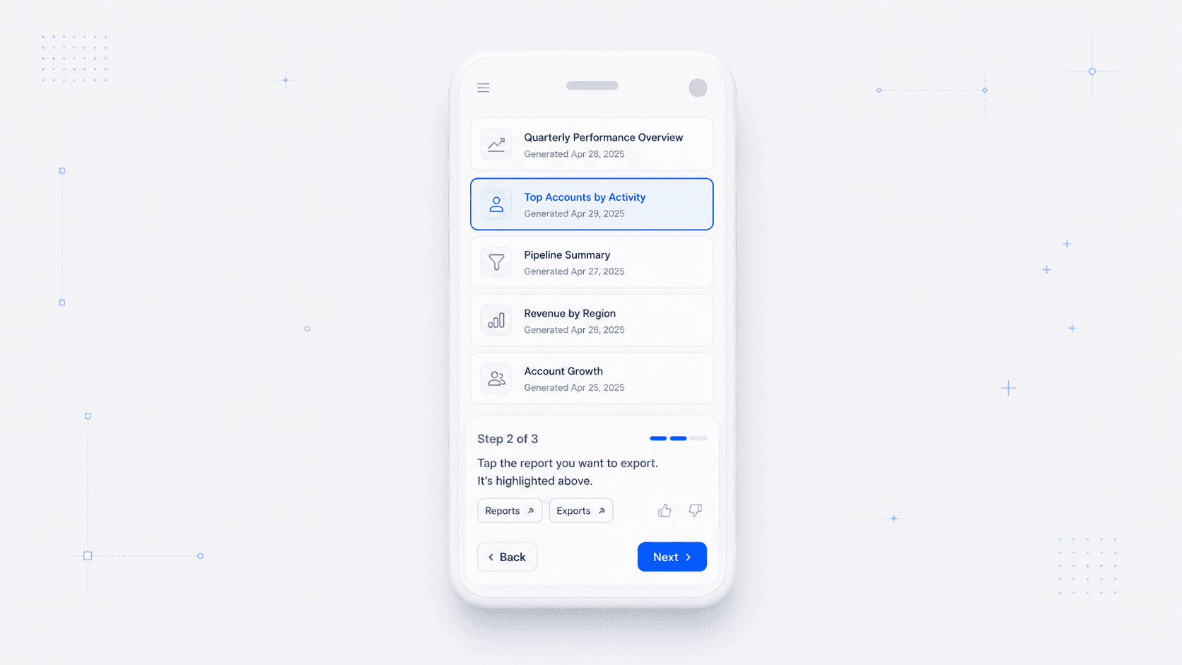
Less is more is the oldest advice in design, and on a desktop you can definitely ignore it often without paying for it. A panel can show your question, the answer, the sources, and four follow-ups at once, and the screen absorbs all of it simply because there's plenty of screen to go around. You still want to be cognizant of how you present information in an effort to be as concise and efficient as possible, but the leeway is there.
On a phone there is no room to ignore it. Whatever space Frigade Assistant takes up on screen is space that is taken away from your product. Every element has to justify and make the case for the space it occupies. Designing the mobile assistant was mostly subtraction.
How much of this product can we remove and still keep the soul of what it does?
You may have seen that we shipped mobile web support recently. The mobile feature page covers what it does, and this is the design work underneath it.
Keep the skeleton the same
When we started designing for mobile, we wanted to strike a balance of removing as much as we can to make this effort tenable, but also keep as much of the product intact as possible.
What we centered on was an architecture where the underlying bones: state machines, API calls, overall structure remains the same.
We hand built and re-designed every UI element and component: message bubbles, the answer and guide cards, clarify options, the feedback row, and source pills are hand re-built for mobile. This architecture decision lets us build on the same backend our desktop assistant already runs on, but also tailor a UI that is specially designed for mobile in order to better serve the task at hand.
There is a real case against it: two sets of visual components will cause drift and extra work. With two different UIs, you need to maintain different code bases. Different design decisions, different contexts to switch between, and every time a change needs to be made, you have to consider that change on both mobile and desktop UIs.
We determined that this was a benefit. If we had to reconsider the UI of our assistant on mobile, then our customers likely had different UI patterns on mobile as well. This being the case meant that we had to adapt with what people are familiar with rather than taking our desktop application and making it small. The deviation and bifurcation is a small price to pay for a better experience for the customer.
The question comes off the card and what it says about reduction
Condensed, the desktop panel shows your question above the answer. That is right on a screen with room for both. On a phone it puts a person's own words on top of the thing they just asked for, and they already know what they asked.
So the mobile answer card holds only the answer. Removing one element sounds small, and the differences are all like that: individually small, and collectively a different UI.
This is the ethos behind the designs here. Every element that follows got the same question asked of it, and each one came back smaller.
The card is only as tall as its answer
We landed on three heights for the sheet: docked at the bottom edge, a card, or full screen.
The card is what you get by default, and it sizes itself to the answer rather than to a layout. Most answers on a phone are instructions about the screen behind the sheet, so if we cover that screen, the answer stops being useful at the exact moment someone needs it. Docked, the sheet shows only a title, so you can go act on what you read and find the conversation waiting. Full screen carries sources, follow-ups, and everything the desktop panel holds, and only comes up when someone asks for it.
Two gestures do two different jobs here, and getting them to stop fighting took a few passes. Dragging the handle changes the sheet's height, so the top edge follows your thumb while the bottom stays where it is. Dragging the sheet itself throws it to the other edge of the screen, so when it is covering the thing you are trying to look at, you can move it to the top and carry on.
It also moves on its own. When the assistant works out that it is covering something you need to see, it relocates to whichever edge is furthest from it. If you have already moved it yourself, it stays where you put it, because relocating a sheet you placed by hand overrules a decision you already made.
The launcher badge and the composer are one element rather than two, so tapping the badge grows it into the composer instead of swapping one for the other. Its corner radius has to travel with it, and stay concentric while it does, or the corner tightens visibly as the width moves.
Nothing to show is a state of its own
A lookup that has nothing in it for you to decide gets a labeled pill instead of a sheet. Opening a whole panel on an empty thread to announce that we are thinking costs you the view you were using and gives nothing back. A confirmation still earns a card, because there is an actual decision sitting inside it.
Giving back space it never had
When the assistant walks you through a guide, it points at real controls in your product, and on a phone it is regularly sitting on top of the one it wants to point at. Moving out of the way covers most of that. The rest is in the scrolling: we center a target in the band that is still visible rather than in the viewport, and that band changes as the sheet changes height.
Then there is space the assistant never had to begin with. Docked, it runs the full width of the screen, which puts it exactly where mobile apps put their tab bar. We looked at hiding it on scroll, and at giving people a control to tuck it aside, and both answer a permanent condition with a gesture you have to keep repeating.
So we measure instead. The assistant reads whatever your app has fixed to the bottom edge and positions itself above it, with enough skepticism to avoid clearing the wrong thing: a floating action button is not a tab bar, and neither is a full-screen modal, which would push the assistant off the screen. The keyboard, the home indicator, and your tab bar all resolve into one number, and nobody has to describe their layout to us.
Where less stops being a virtue
Subtraction has a floor, and on a phone that floor is higher than on a desktop. Every tappable target is at least 44 pixels, including the source pills that are small chips on desktop. Nothing renders below 16 pixels, partly because iOS zooms the whole page when someone focuses an input smaller than that, and partly because a type sweep turned up headings rendering smaller than the paragraph beneath them.
So we take less of your screen and spend more of what we take. One answer, at 16 pixels, with 44-pixel targets, makes a small surface rather than a dense one, and it never asks anyone to aim.
Mobile web support is in early access now. The question we started with has very little to do with phones: any surface where the assistant does not own the screen ends up asking it, whether that is a native app, a tablet in split view, or a panel living inside someone else's layout. Work out what you can take away, and give the rest back.